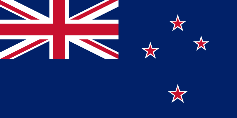
It has come to my attention that the Australian flag is boring and rubbish.
According to flagsaustralia.com.au “there are no compelling reasons why [the Australian flag] should change.” There are, in fact, TWO compelling reasons why the Australian flag should change. The Australian flag is BORING and RUBBISH.
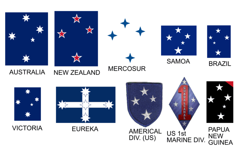
So is the New Zealand one for that matter. What is this mad obsession with the Southern Cross? Apart from Oz and NZ, it’s on the flags of Brazil, Samoa, Papua New Guinea, Christmas Island, Cocos Islands, Niue, Tokelau, New Ireland, Tierra del Fuego in Argentina and the Magallanes Region of Chile. Get over it.
Okay, so it could be worse, I suppose (they could be lumped with a tricolour) but still, you’ve got to admit it’s pretty uninspiring stuff:

And what the hell is that in the top left hand corner?? I’m sorry, but if the Australians are going to insist on charging British people over the odds for tourist visas and continue to mispronounce words like “debut” (they say day-boo! Seriously! DAY-BOO!!! Ahahahaha!) then they should NOT be permitted to co-opt our incredibly well-designed flag just to make theirs a little more exciting.
So today I started looking on the internets to see if anybody had come up with a cool new design. Something that says “AUSTRALIA!!!” loud and proud without cowering behind the stockings of mother Britain, or using a logo that is ubiquitous across the entire Southern Hemisphere, or looking like it might be the flag for New Zealand ‘cos they look exactly the frikkin’ same from a distance…

And it seems like a fair chunk of the Australian population agree with me. So why hasn’t the flag been re-designed? Well, for the same reason they still haven’t got rid of Queenie: the vast majority of Australians haven’t got the foggiest what they should replace it with.
Surely some bright spark in the 223 years of Australia’s existence could have come up with a decent alternative to the banal rag on a stick that currently flies above parliament. Well, you’d think…
Let’s Look At The Competition
Here are some ‘professionally designed’ flags off Australia’s main ‘let’s change our crappy flag’ website:
Erm… excuse me? Hi. I was just wondering, you know, what makes this not the flag of ANY OTHER COUNTRY IN THE GODDAMN SOUTHERN HEMISPHERE? Try again.

Ah yes, I see what you’ve done there: you’ve made the same flag as above but you’ve changed the colours around and you’ve fimbriated it. And it says ‘Australia’ to who? The dingos?? Rubbish.
 This one looks like a Pepsi Ad from the 80s. With Coke’s dynamic ribbon added for a giggle. Is that supposed to be Uluru? Crikey, you’d be hard pressed explaining that to your average Aussie, never mind your passing Bolivian. Does England put Stonehenge on the flag?
 Ah… at LAST! A flag that says “AUSTRALIA!!” Unfortunately it looks like something halfway between a kanga warning sign and the Qantas logo. Kangaroos are ridiculous looking creatures at the best of times and already feature on the crest of Australia. No.
Here are some more, almost all of them clinging to the Southern Cross as if it means something more special to Australia than to the other 100+ countries of the planet that can also see the Southern Cross.
The only one of these 12 designs that screams ‘AUSTRALIA!!!’ is the kangaroo one, top right. I’m sure the original is of great anthropological interest, but come on – it looks like it was drawn by a six year old. Not cool.
Stuff the Goddamn Southern Cross
In a survey posted on the same site, 41% of respondents in a given opinion poll thought it necessary to depict the Southern Cross on the Aussie flag. It seems that some Australians believe that you can only see the constallation Crux from the top of Uluru. This is not the case. The Southern Cross is visible from anywhere south of France. It just goes to show why nothing important should be put to a public vote. Like the Australian National Anthem, yeah?
It’s fairly clear that Australians, by and large, want a new flag, but just haven’t been presented with a decent alternative… yet.
Given that I’m fairly well positioned to exploit my current surroundings and I believe you should never criticise something unless you’re damn sure you could do a better job yourself, I’ve designed Australia a lovely new flag.
Ain’t I the sweetest?
The main concept in my mind was stuff the goddamn Southern Cross. The only visual message conveyed by the design is “I’m from the bottom half of the planet!”. Now might be a good time to reiterate the fact that there are 47 countries in the Southern Hemisphere. The Southern Cross says ‘Australia’ about as much as a cloud says ‘England’: you can see what they’re getting at, but as a unique feature, it’s an epic fail.
Australia’s Greatest Symbol is Australia
Very few countries could get away with using the shape of the country on their flag (just from the outline, could you identify Albania, Uzbekistan, Paraguay…?), but Australia can and therefore it should.
The shape of Australia is a design classic – used on Australian logos, designs, icons, websites, products the world over. Why? Because everybody who has ever glanced at a map of the world knows the damn shape!! It’s not just an island continent, it’s THE island continent – the ONLY one on the planet – sitting there in the middle of the deep blue sea saying “don’t I look AWESOME?”.
So I based my design on the Aboriginal flag but with the central solar disc swapped for the iconic shape of Australia itself. I also changed the colour of the lower half of the Aboriginal flag from red to green: green and gold being the National Colours of Australia.
You can try it in different colours, but – trust me – it won’t look as cool.
While 29 national flags use red, white and blue, there’s only one other flag that uses black, green and yellow: and that’s Jamaica, possessor of one of the coolest flags in the world.
So here we have
- a colour scheme that is very unique, but still aesthetically pleasing
- a combination of the colours and designs to reflect both modern Australians and the country’s heritage – this flag is 50% aboriginal and 50% modern Australian.
- a design that is striking, simple, effective, timeless and will make any true red-blooded Australian get off their fat arses, man up and salute their it’s-alright-I-suppose antipodean home.
People of Australia, behold your NEW AUSTRALIAN FLAG:

Next up, New Zealand…


A note about the use of the map of Australia: some commentators have pointed out (long before today) the inherent problem with maps on flags is that they do not reverse well. The only other two flags to use a map are Cyprus and Kosovo, possibly for this very reason…
But consider for a moment how many flags feature inscriptions: Brazil, Saudi Arabia, Andorra, Iraq, Afghanistan, Brunei, Egypt, Iran, Eritrea, Bolivia, Belize, Costa Rica, Dominican Republic, El Salvador, Equatorial Guinea, Guatemala, Haiti, Malta, Nicaragua, Spain and Venezuela: they function just as well on the reverse as they do the obverse.
If the question is “will anyone – at a distance and looking at the reverse side – mistake this flag for another country’s?” the answer is a very patent NO. Which is more than I can say for the current design.
[edit] – BTW, the UN flag has a map on it too.
Why don’t you get thousands of comments for every post? You’re way ahead of your time kiddo. Don’t be discouraged, there are some of us out here who get it and recognize (and admit it) when the truth slaps us in the face
Ozzy flag and the NZ flag other way round mate
NZ’s flag would have been fine and distinctive if Australia hadn’t come along and plagiar…erm…designed something similar. The current NZ design was in use in New Zealand for decades (and officially as national flag for about a year) before Australia came up with their design. There’s a suggestion that – like the Eddie Izzard video – it was a tongue-in-cheek “claiming” of Australia as part of NZ, and the Aussies simply haven’t got the joke yet.